The Science of Color Theory: A Guide for Art Educators
18 July 2025
Color is everywhere—it’s in the sky, in the clothes we wear, even in the food we eat. But have you ever stopped to think about why certain colors make us feel a certain way? Or why some color combinations are visually appealing while others just don’t work? Well, that’s where color theory comes in.
For art educators, understanding color theory isn’t just about mixing paint—it’s about teaching students how to see, interpret, and use color in creative ways. Whether you're shaping young minds in a classroom or mentoring budding artists, a solid grasp of the science behind color can make all the difference.
This guide will break down color theory in a way that's easy, engaging, and, most importantly, practical for art educators. So, let’s dive into the fascinating world of color!
What is Color Theory?
Color theory is the science and art of using color. It’s a set of guidelines that helps artists and designers understand how colors interact, how they affect emotions, and how they can be combined to create visually pleasing compositions.At its core, color theory is about three main things:
- The color wheel – A visual representation of colors and their relationships.
- Color harmony – How colors complement, contrast, or clash.
- Color psychology – How colors impact emotions and perceptions.
As an art educator, breaking these concepts down for students can help them develop a stronger artistic foundation.
The Color Wheel: A Visual Cheat Sheet
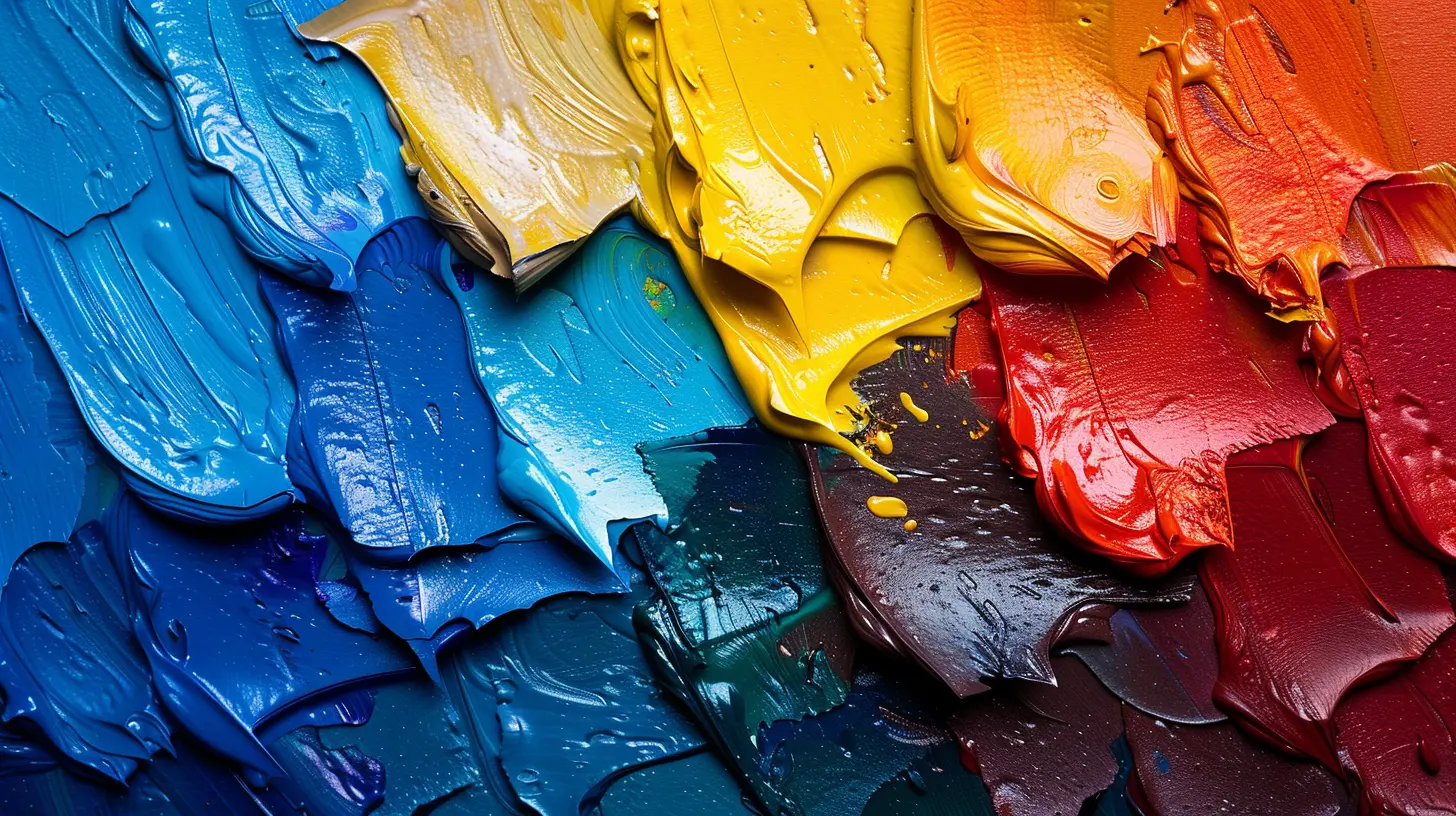
The color wheel is like the alphabet of color. Once you understand it, you can "speak" the language of color fluently.The basic color wheel consists of three types of colors:
1. Primary Colors
- Red- Blue
- Yellow
These are the building blocks of all other colors. You can’t create them by mixing other hues.
2. Secondary Colors
- Orange (Red + Yellow)- Green (Blue + Yellow)
- Purple (Red + Blue)
Mixing two primary colors gives you a secondary color. Simple, right?
3. Tertiary Colors
When you mix a primary color with a neighboring secondary color, you get six tertiary colors:- Red-Orange
- Yellow-Orange
- Yellow-Green
- Blue-Green
- Blue-Purple
- Red-Purple
Understanding this wheel helps artists predict which colors will blend beautifully and which might result in a muddy mess.
Warm vs. Cool Colors: The Temperature of Art
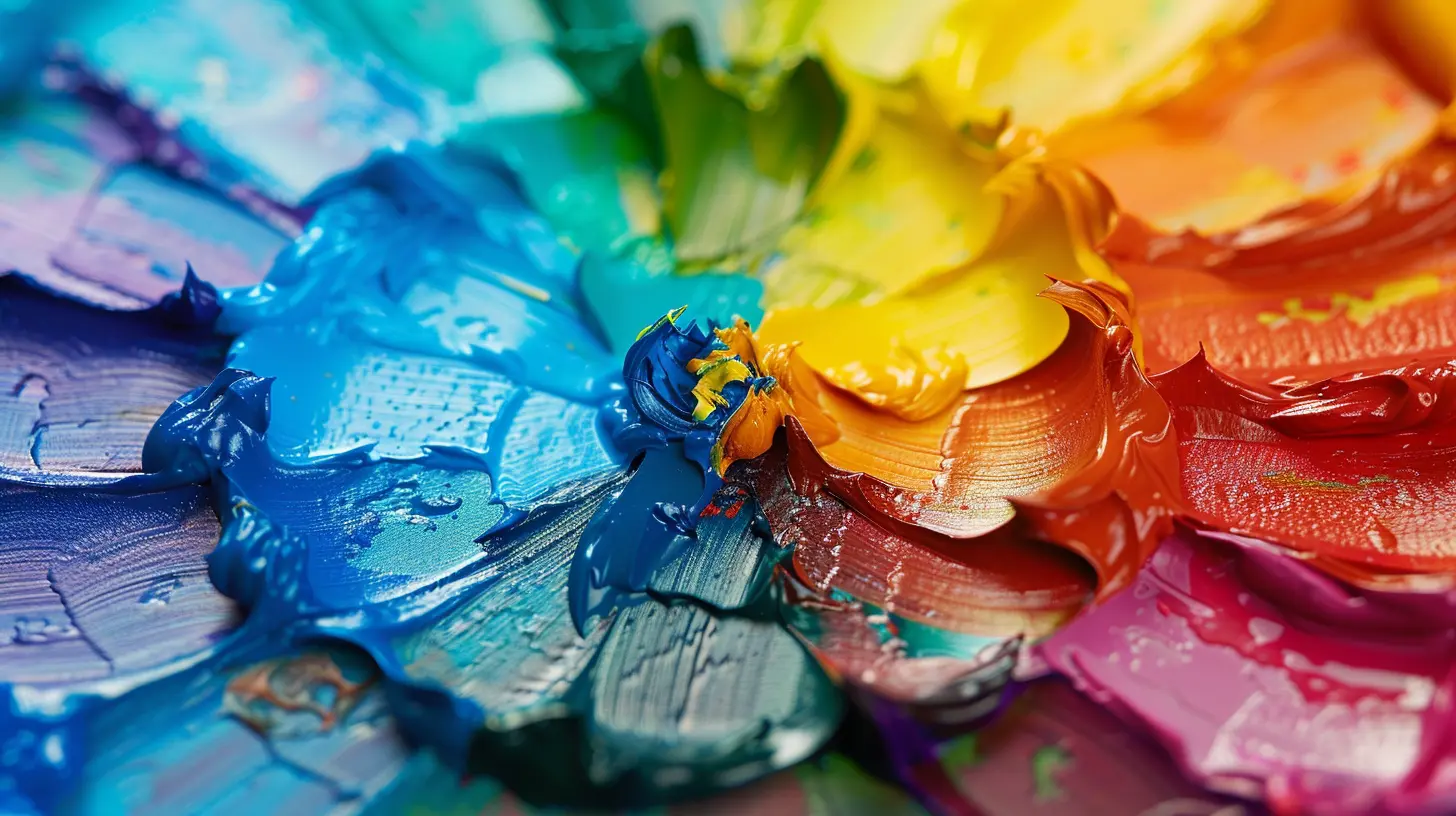
Colors aren’t just about aesthetics—they have temperature too!- Warm colors (reds, oranges, yellows) feel energetic, exciting, and cozy.
- Cool colors (blues, greens, purples) feel calm, relaxing, and refreshing.
A warm-colored painting can make a viewer feel cozy and energized, while a cool-colored painting might evoke peace and tranquility. As an educator, teaching students how to use temperature in their artwork can help them set the right mood in their creations.
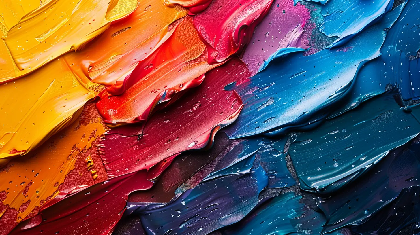
The Magic of Color Harmony
Have you ever looked at a painting and thought, "Wow, these colors just work together?" That’s because of color harmony.Here are some classic color harmony techniques that you can introduce to your students:
1. Complementary Colors – Opposites Attract
Complementary colors sit opposite each other on the color wheel (e.g., red and green, blue and orange). When placed together, they create high contrast and visual pop.Great for: Bold, eye-catching compositions
2. Analogous Colors – Best Friends on the Color Wheel
Analogous colors are neighbors on the color wheel (e.g., blue, blue-green, green). They create a soft, harmonious look because they naturally blend well.Great for: Dreamy, soothing artwork
3. Triadic Colors – A Balanced Trio
A triadic color scheme uses three colors evenly spaced on the wheel (e.g., red, yellow, and blue). They offer contrast but maintain harmony.Great for: Vibrant, dynamic compositions
4. Monochromatic Colors – Different Shades of the Same Hue
This scheme sticks to one color and plays with different tints (adding white) and shades (adding black). It’s super sophisticated and elegant.Great for: Minimalist, serene designs
Color Psychology: How Colors Make Us Feel
Ever wondered why fast food brands love using red and yellow? It’s not just a coincidence! Colors have psychological effects, influencing moods, emotions, and behaviors.Here’s a quick cheat sheet for common color meanings:
- Red – Energy, passion, urgency (Think fast food logos!)
- Blue – Calm, trust, professionalism (Popular in corporate branding)
- Yellow – Happiness, warmth, cheerfulness (Evokes positivity)
- Green – Growth, nature, health (Great for eco-friendly messages)
- Purple – Royalty, creativity, mystery (Think luxury brands)
- Black – Power, sophistication, elegance (Used in high-end branding)
- White – Purity, simplicity, cleanliness (Perfect for minimalist designs)
As an art teacher, helping students understand color psychology allows them to create pieces that connect with people on a deeper level.
Teaching Color Theory: Fun Activities for Your Students
Learning color theory doesn’t have to be boring! Here are a few engaging activities to help students grasp the concept:🎨 Color Mixing Challenge
Give students red, yellow, and blue paint and challenge them to mix secondary and tertiary colors. It’s a hands-on way to understand how colors interact.🖍️ Color Emotion Collage
Ask students to create a collage using magazine cutouts based on a specific mood (e.g., excitement, calm, sadness). This helps them recognize the emotional power of colors.🏗️ Complementary Color Portraits
Have students create self-portraits using only complementary colors. They'll quickly see how dramatic and vibrant their artwork becomes!Why Color Theory Matters in Art Education
So why should art educators take color theory seriously? Because color is communication. It helps students:✔️ Develop better compositions
✔️ Make more intentional artistic choices
✔️ Understand the emotional impact of art
✔️ Enhance their creativity and confidence
By incorporating color theory into lessons, teachers can give students the tools to express themselves more effectively. And who knows? They might just create the next masterpiece!
Final Thoughts
Color theory is like the secret ingredient in great artwork. It’s not just about knowing which colors look good together—it’s about understanding why. As an educator, your role isn’t just to teach, but to inspire students to see the world differently through color.So, the next time you step into your classroom, remember: you're not just teaching art—you're teaching the language of visual storytelling. And that’s a pretty amazing thing.
all images in this post were generated using AI tools
Category:
Art EducationAuthor:

Olivia Chapman
Discussion
rate this article
1 comments
Beatrice Anderson
This article brilliantly simplifies color theory, making it accessible for art educators. Understanding color interactions enhances teaching techniques and fosters creativity in students. Great resource!
July 27, 2025 at 5:04 AM

Olivia Chapman
Thank you for your kind words! I'm glad you found the article helpful for enhancing teaching techniques and fostering creativity.

